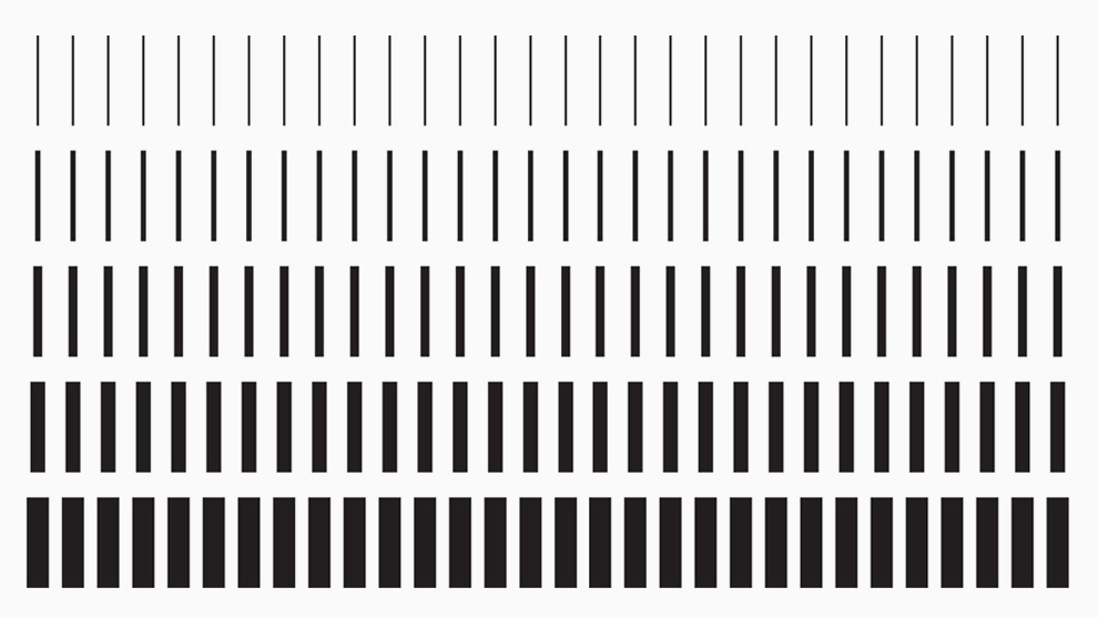
To coincide with the Museum of Contemporary Art Toronto’s move to an awesome, multi-story new space, we developed a new visual identity and launch campaign. Our stacked logo with graduated font weights was inspired by the structure of the building itself. Moving up the floors, the pillars get thinner and thinner as their load-bearing demands get lighter and lighter. This graduated look is carried through on the museum’s signage, graphic elements and merchandise.

“MOCA: New Building. New Vis ID.”
Black screen, white writing. Title: Toronto’s Museum of Contemporary Art was a small, overlooked gallery which lacked a distinct identity.
Exterior shot: previous MOCA building.
A map with a red pin showing the location of the old MOCA building. Title: In 2018, MOCA would re-launch in a new space– a 100-year-old factory. A green pin forms on the map in MOCA’s new location, and a line animates out of the red pin and grows towards the green pin.
Exterior shot: new MOCA building.
Black screen, white writing. Title, forms from bottom to top: Launching The New MOCA Toronto.
Title disappears, black fades an exterior shot of the new MOCA building. Title: From The Ground Up.
5 interior shots of the new MOCA building.
White screen, black writing. Title: The identity was inspired by the buildings most dominant feature.
Still shot of the first floor of the new MOCA building, a column is highlighted. Title: Columns.
Still shot of the second floor of the new MOCA building, a column is highlighted. The column is narrower than one on the previous floor. Title: that narrow.
Still shot of the third floor of the new MOCA building, a column is highlighted. The column is narrower than one on the previous floor. Title: as they climb.
Still shot of the fourth floor of the new MOCA building, a column is highlighted. The column is narrower than one on the previous floor. Title: through all floors.
White background. Graphic: 5 rows of vertical lines, where the lines are the same weight as every other line on its row, and the line weight of each row increases from top to bottom. Title: This Became The Brand Pattern.
Gray background. Beige tote bag with the 5 rows of vertical lines, “Bag Of Contemporary Art” written in the style of the logo is visible on the lower-right of the bag.
Gray background. T-shirt with the 5 rows of vertical lines, “T-Shirt Of Contemporary Art” written in the style of the logo is visible on the lower-right of the bag.
Black background. Poster with the 5 rows of vertical lines, MOCA logo visible on the lower left of the poster.
Title: These columns also inspired the new typographic system.
Title: [Each word appears on its own line and is progressively heavier from “Thin” to “black”.] Thin Light Medium Black.
Title: [One word appears on the screen at a time, and each word is progressively heavier from “Each” to “thicker”] Each line gets thicker.
Title: Inspired by the building.
Title: Museum Of Contemporary Art.
Title: [repeated 6 times using progressively heavier fonts] Opens Sept 22.
MOCA website, showing the headline: Museum Opens Sept 22 in progressive font weights.
Paper invitation to the MOCA grand opening, written in progressive font weights.
Paper brochure given out at MOCA, written in progressive font weights.
Title: The building lived through the type and pattern.
Title: Which was expressed in many forms.
Title: Museum of Contemporary Art.
“Museum” changes to “Idea”, then “Conversation”, then “Merchandise”.
Close-up of the “T-Shirt Of Contemporary Art” on the lower-right of a MOCA t-shirt.
Shot of the whole MOCA t-shirt.
Close-up of a notebook with “Notebook of Contemporary Art” written in the style of the MOCA logo.
Shot of 4 notebooks, ranging colours from black to white and progressively smaller.
Close-up of the “Bag Of Contemporary Art” on the lower-right of a MOCA tote bag.
Shot of the whole MOCA tote bag.
Closeup of the “Chocolate of Contemporary Art” label on a bar of chocolate.
Shot of 5 bars of chocolate, with labels ranging in colour from black to white, and with each bar having progressively lighter marbling.
Shot of 4 lids, each progressively smaller and lighter.
Shot of those four lids stacked from largest and darkest on the bottom to lightest and smallest on the top.
Shot of the MOCA logo on the exterior of the new MOCA building.
Shot of people waiting in line to get in to the new MOCA building.
Shot of a speech in front of the new MOCA building.
Shot of cutting the ribbon in front of the new MOCA building.
8 shots of people inside the new MOCA building.
Exterior shot of the new MOCA building.
Black background, white text. Title: We created a new identity that told a story of a century-old building that housed a contemporary world of art.
Black background, MOCA logo in white.
