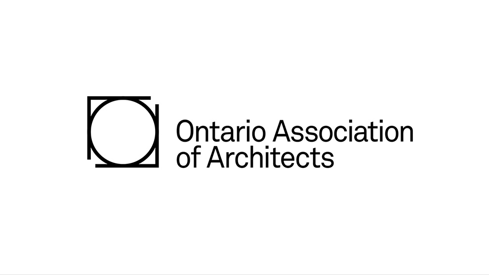
The OAA has regulated the practice of architecture in Canada’s largest province for over 125 years. We were briefed to develop a new brand identity to better reflect the OAA of today – a more inclusive professional body, representing architects of diverse backgrounds, specialities and styles. The circle represents inclusivity. The square, their technical canvas. Together they make the letters OAA.
“Ontario Association of Architects.”
An up-tempo rhythm is playing.
Solid white background.
Title: The Ontario Association of Architects (OAA) wanted a new logo that could better represent architects with different backgrounds, specialties and styles.
Next title: To start, we looked at universal shapes and symbols.
A circle is shown on screen. title: A circle symbolizes a community.
A square missing two corners is shown on screen. title: A frame symbolizes the architect’s canvas.
Several aerial shots of construction sites and the square are shown on screen, before returning to the square on a white background.
The circle is drawn inside the square. the title “Ontario Association of Architects” appears beside it.
The circle/square logo is shown on the lower-right corner of a business card, stationery, and a mailing label.
The circle/square logo is shown on a windowed and a windowless envelope.
The circle/square logo is shown on a poster mailing tube.
The circle/square logo is shown on a business card, and another business card with contact information and a pressed version of the circle/square logo, presumably the reverse side of the first card.
A closeup of the two business cards is shown.
Solid white background.
Title: The shapes also formed the letters of the association.
The circle/square logo is shown, the circle is black and the square is grayed out. Title: O is for Ontario.
The whole logo grays out.
The top and left sides of the square and the top-left quadrant of the circle become black. Title: A is for Architects.
The whole logo grays out.
The bottom and right sides of the square and the bottom-right quadrant of the circle become black. Title: A is for Association.
Solid white background.
Title: And doubles as a certificate of practice.
The circle/square logo is shown on screen. Text is shown around the edge of the top inside of circle: Ontario Association of Architects. Text is shown around the edge of the bottom of the circle: Architect. Text is shown inside the circle: License 2104 – Marques Sawyer Brant.
Text with an arrow pointing at “License 2104” is shown: Issued with a license number
Text with an arrow pointing at “Marques Sawyer Brant” is shown: And the name of the member
Solid white background.
Title: To certify a drawing plan, the seal must be stamped and signed.
A drawing plan is shown on screen. Zoom in on the lower right of the drawing plan to show the circle/square as a certificate of practice. A signature appears across the logo.
Zoom out to show the logo and the certificate. Title: Ontario Association of Architects.
Music ends.